CLIENT: BSkyB
BSkyB is also known as British Sky Broadcasting, or simply Sky. They are located in the greater London area. Although most Americans are unfamiliar with the company, Sky is one of the UK’s most well known brands. They are a broadcasting, broadband, and telephone company with over 10 million customers. They own Sky News, Sky Sports, and several of their own TV stations. To compare them to a US company, they are like Comcast, ESPN, HBO, and CNN, all in one. They have several mobile applications that are consistently within the top downloads in the UK, alongside Facebook and Skype. SkyCreative is one of the largest creative groups in Europe, and Sky aims to be the largest technology company in the UK.
PROJECTS:
Responsive Design Guidelines / Mobile Self Service / SkySports Olympic Mobile Coverage
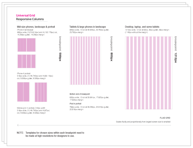
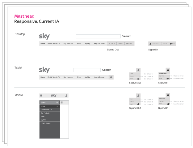
Responsive Design Guidelines
As a mobile web expert at Sky, I was asked to help reshape Sky.com, Sky News, and Sky Sports to become responsively designed websites. I created a global guideline that accomplished two main goals. The first goal was to responsively design the site foundation and interaction patterns so that they worked fluidly across any computer or device. The second goal was to create consistency across all Sky properties. Sky is a large company with many different stakeholders, designers, and developers. Because there were no interaction guidelines, each team had its own way of building components of the site. A guideline was crucial in creating a new responsive site with a consistent experience across company channels. Along with these goals, I focused on customer usability and creating solutions that would be easy for developers to implement across departments.
My work on this project included problem solving, wireframing, defining patterns, consulting with dev teams, and giving guidance to designers who had never designed for mobile devices. I worked with visual designers to help flesh out the foundation that I created. The document was then shared with the design and development teams to use as they designed the new responsive site. The document was over 70 pages and included guidelines on the following subjects: designing for mobile; universal grid; masthead and footer; Sky logo; iconography and graphics; fonts; colors; online forms; responsive advertising; image sizing and carousels; video delivery and video player; buttons and links; touch gestures; and navigation.
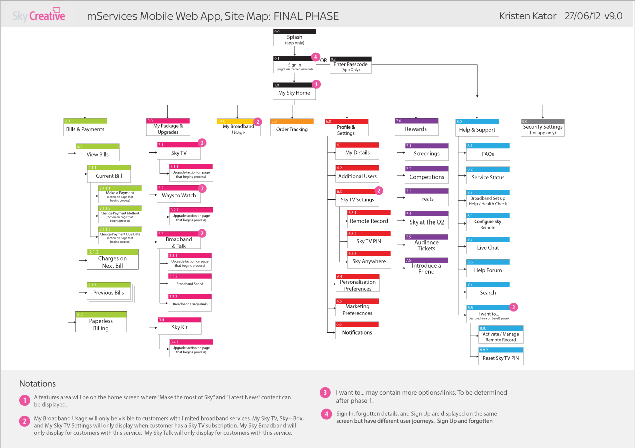
Sky Mobile Service
Sky has over 20 mobile applications across iPhone, iPad, Android, and WP7. Sky wanted to incorporate a “MySky” service within each of its apps that would allow customers to access account information and get help on common questions. Their solution to provide this service across all of their apps on every platform was to show an “in-app” mobile web view of a mobile site that looked and felt like part of the native application. They hired me on a two-year contract to create the user experi-ence and visual design of this service.
I worked as the lead designer within a mobile web development team, practicing Agile scrum methodologies. Many times, I played a business analyst role—gathering requirements, understanding back-end systems, and analyzing processes within Sky.
As the lead UX designer, I delivered usable solutions for customers. I assisted with usability research and created wireframes, user task flows, and interfaces for the mobile web. I produced visual designs and graphics based on my understanding and implementation of Sky’s brand and toolkit. I worked with other UX designers and creative directors in order to produce experiences for customers that were consistent across Sky’s online communications. I also worked closely with the product owner to gather requirements and help organize the team’s user stories and tasks.
The site let users do things like view their bill, upgrade their product package, track their orders, reschedule engineer appointments, change their settings and preferences, get service updates, get help on FAQs, and get free movie screenings with a mobile ticket. The following pages show a few of these features but not all.