Visual Design
I started my career in design as a print and web visual designer for clients such as Microsoft, General Motors, Starbucks, and Procter & Gamble. When I started working on complex websites and mobile applications, I focused more on interaction design. Below are some examples of visual design projects that reflect the design trends of the time. I continue to stay up-to-date with visual design trends and consider myself a well-rounded designer with both visual and interaction design skills.
PROJECT: HOSPITAL LOGO DESIGN
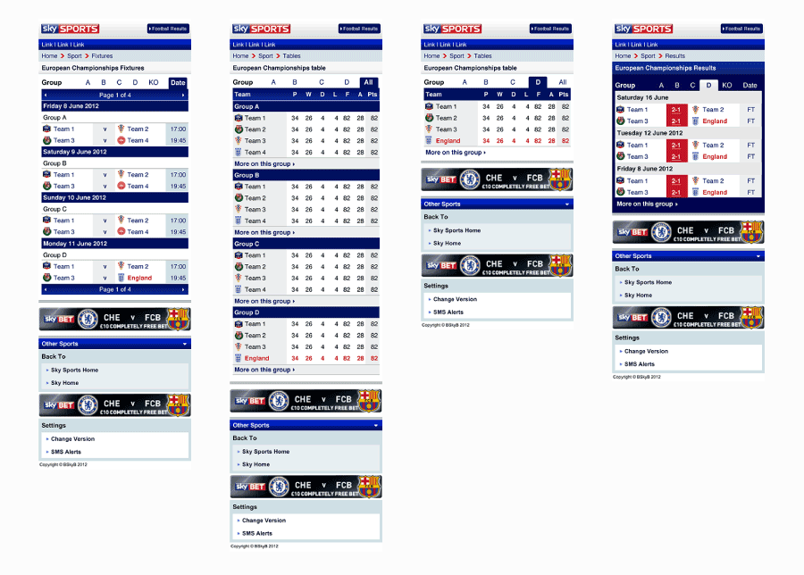
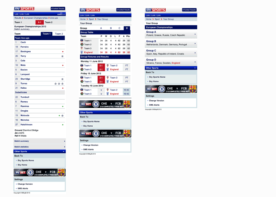
PROJECT: SKY SPORTS NEWS MOBILE WEBSITE
PROJECT DESCRIPTION
As part of the mobile web development team at BSkyB, I worked on several different Sky Sports News mobile projects. I mostly worked on wireframes and other typical UX documentation, but I occasionally worked on visual design projects when needed. The design work above simplified the original visual design of the Sky Sports mobile website for fixtures (schedules), tables, and results (scores).
PROJECT: AUDI iPAD APPLICATION


PROJECT DESCRIPTION
As part of a job interview, I was given several design assignments. I was asked to design three screens for an Audio iPad application to demonstrate my visual design abilities. The client also wanted to see how I would apply a well known brand to a design project.
PROJECT: MICROSOFT INTERACTIVE HOLIDAY GIFT GUIDE


PROJECT DESCRIPTION
While working as a lead digital designer at Waggener Edstrom's PR agency, I created many interactive pieces for our biggest client, Microsoft. The Holiday Gift Guide was a flash-based interactive panel that showcased Microsoft's hottest products for the holiday season.
PROJECT: MICROSOFT @ CES


PROJECT DESCRIPTION
Microsoft hired Waggener Edstrom's Digital Strategies team to create a landing page to promote its consumer products at the annual Consumer Electronics Show in Las Vegas. The page served as a launch page to direct reporters to various events, videos, blogs, and product information.
The challenge of this project was to give Microsoft a cool, hip feel to relate with a young consumer audience, while at the same time keeping Microsoft's brand intact. To achieve this, we brightened Microsoft's color palette and used contrasting grey tones. We also chose photos that had a trendy look and feel. The other big challenge was that it was one of the first sites to be developed in Silverlight's beta version on Microsoft.com.
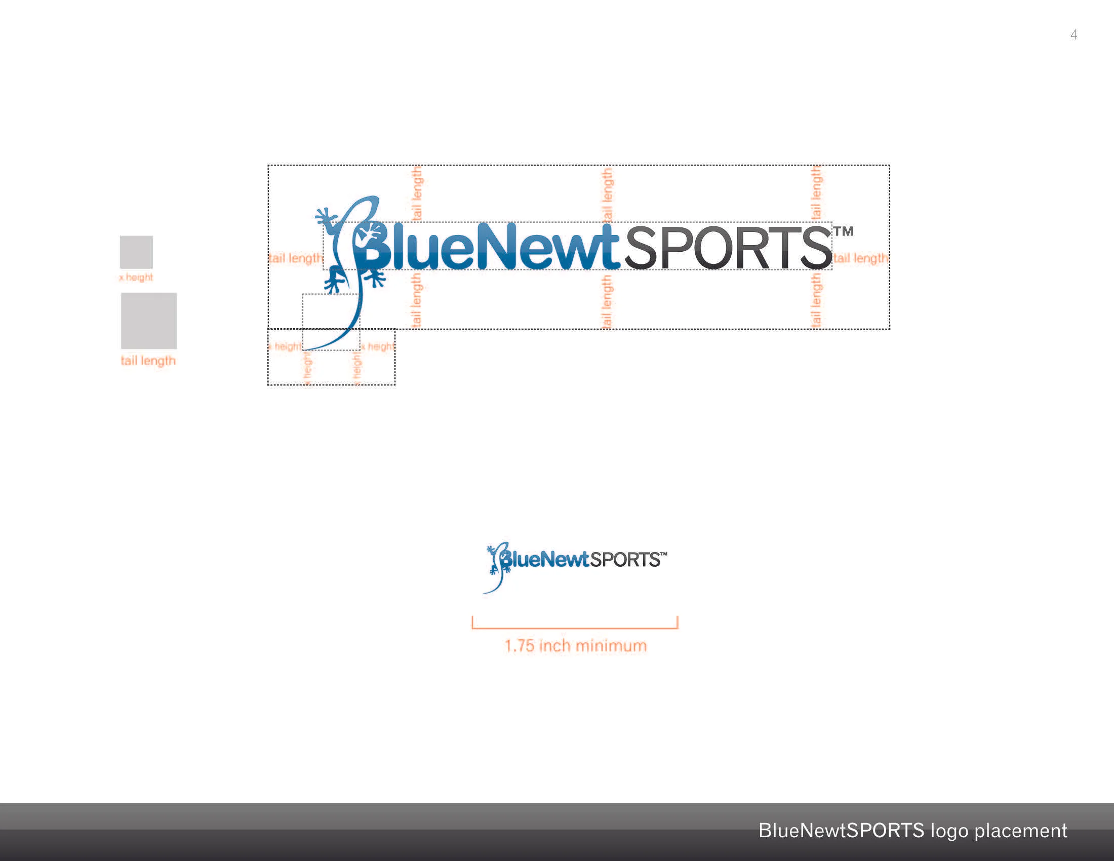
PROJECT: BLUENEWT SPORTS BRAND & STYLE GUIDE


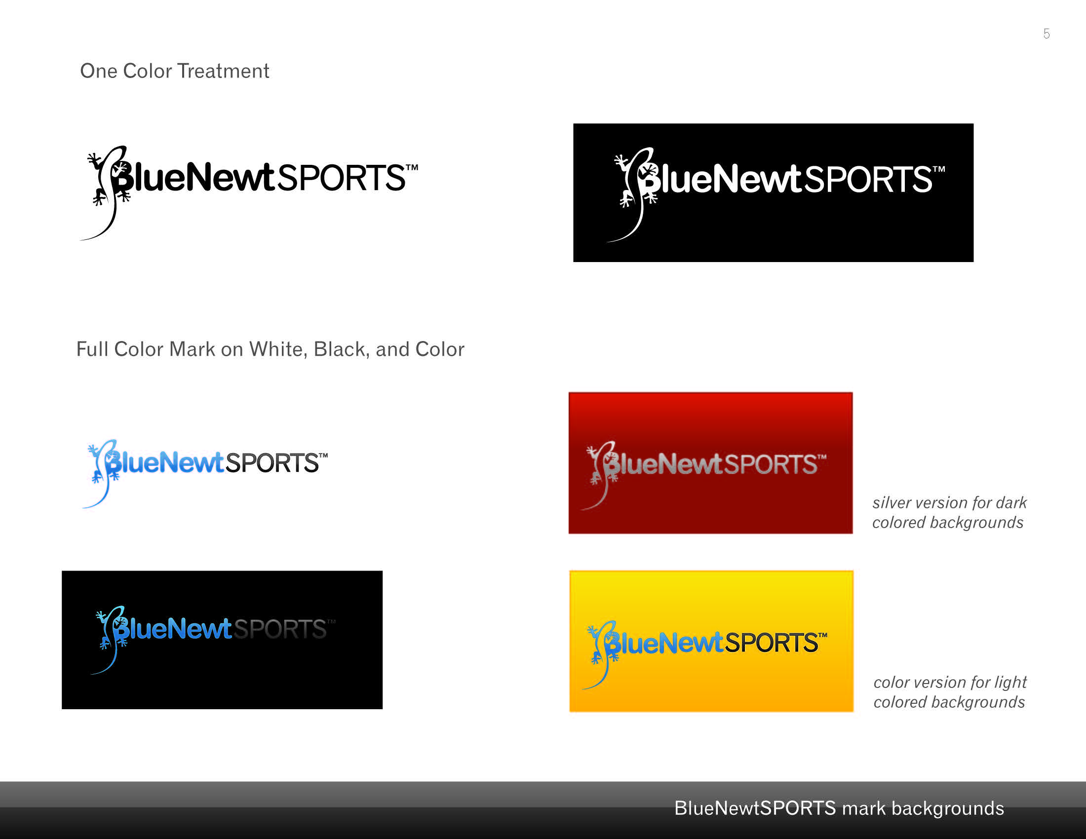

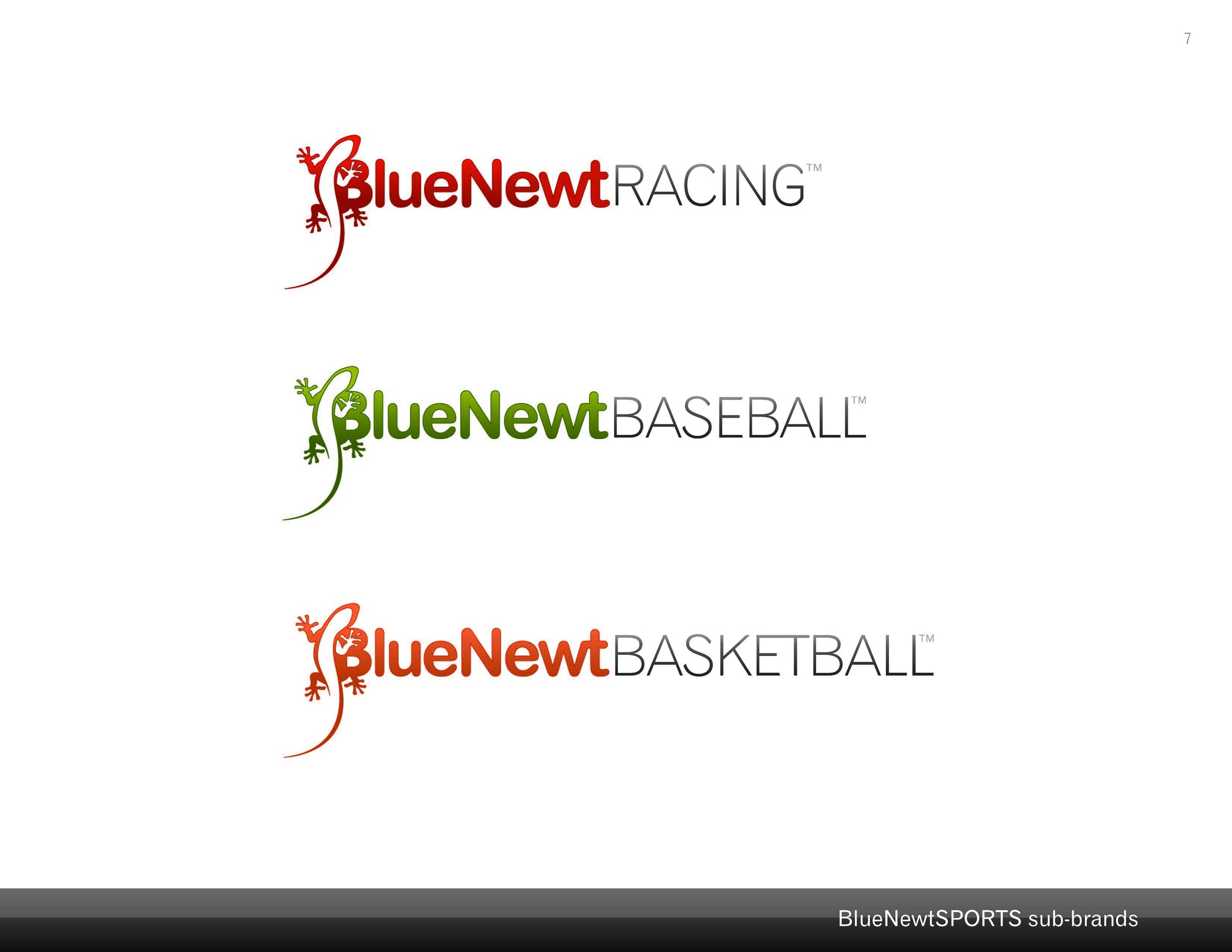


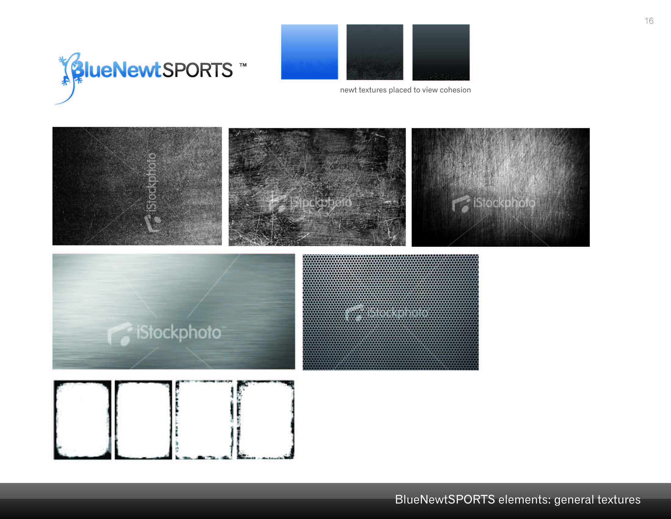


PROJECT DESCRIPTION
BlueNewtSPORTS was a start-up company in 2009 that developed an online fantasy sports simulator. The company was run by two thirty-something sports junkies. They contracted me to design their website which would house their beefy coded simulator. As I began working with them, I recognized the need to update the logo and create a brand style guide. The guide included the usual contents...logo usage, colors, typefaces, brand imagery, etc.
PROJECT: PHOTOS BY MY FATHER


PROJECT DESCRIPTION
Photos by My Father is a book I designed for my dad. It was a collection of my father's photographs taken from 1975 to 1999. Many of the images in the book were found scratched and faded in an old box in Dad's basement. I was determined to save and preserve the photos. After scanning and patiently retouching each photograph, I carefully selected, cropped, and recolored the best images. I then created a design and laid out the pages. Now the photographs are in book format for everyone to see and enjoy.
The chapters in the book are arranged by photographic subject. The chapter titles reflect the interests and hobbies of my dad, who is often found hiking the hills of Idaho, bird watching on the banks of the Alexander, and taking photographs at Mike's ponds.
PROJECT: LONDON TUBE MAP


PROJECT DESCRIPTION
I spent several years in London looking at Underground tube maps. I was inspired to create a tube map of my own made from type only. The map makes a pretty sweet poster and is hanging in my guest room.
PROJECT: RENDER DESIGN JOURNAL

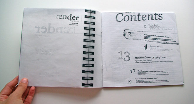


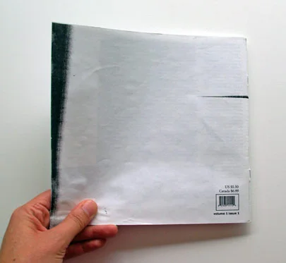
PROJECT DESCRIPTION
The design journal was one of the last projects I created in college, and I still pull it out every now and again for inspiration. The concept of the journal is to show the creative process from beginning to end. The book starts out like a rough draft–hurried handwriting and editing notes. As you get closer to the middle, the layout starts to take shape but is still not complete. The last article is much more structured and clean. The journal is about what happens in the process, and it strives to answer the question "Why do we create?"